Statement of Intent
In photography, we are beginning the theme of different Landscapes, throughout the topic I am going to look at types environments like urban(buildings, cities and skylines), countryside (natural, trees and parks) and seaside(beaches, sea and sand), throughout a variety of weather and types of day. With these images I am going to compare them and look at different contrast. My initial research will be artist research, I will provide a variety of artists such as Adam Burton,Christopher Relander I will talk about what I like and the techniques they have used which I can demonstrate in my own portfolio.
The majority of my project will be on Photoshop once I have gathered my photos as I am planning to merge nature and trees in with portraits, peoples faces. I might also play around with other environments like cities and urban landscapes to experiment with the structure of the buildings. I will remember to screenshot my methods of how I achieve this and write about the process and show the original images I used to get there. I have decided to choose this idea because I believe it is very creative and different.
When shooting I will use a DSLR camera on Manual mode to demonstrate my understanding of the camera.
When shooting the portraits I will shoot in a studio make sure the subject is in front of a white wall and my lighting is correct to get the best results. When shooting trees and nature I will shoot in the daytime with natural lighting, I will capture mostly the ends/tips of trees/nature so it is easier to edit in Photoshop and merge with the faces. Overall I believe this project will be interesting and challenging and something I am looking forward too.

Anglesey
Sunset


Adam Burton


|
I chose this image because it is very detailed and powerful. the photographer has shot at a specific time of day (sunset) to create an explosion of purple, orange and pink colors in the sky. He has used rule of thirds to place the horizon directly in the middle of the image, this positions the clouds at an upward angle, creating the illusion that the image is reaching out of the screen. I believe these colors have been edited in Photoshop and shot with a very expensive lens, stretching the sea far behind. From what I can see, looking at the movement of the water and waves, the image is taken with a slower shutter speed. this maintains the rocks rough structure and the waters soft texture, and to hold this form the photographer needs to capture this image on a tripod in a specific time of day(around sunset) to capture the colors.
This picture attracts me because I love the vibrant colors. The dark purple clouds and luminous, sparkling blue creates a mysterious atmosphere. I love how there is a lightning strike in the distance, the rocks are colorless and bleak on the dark sand. Beaches are normally remembered as hearty, pleasant and relaxing however this picture is the opposite. The photographer has most definitely edited the colors in this shot in Photoshop, and when shooting, has included more clouds than sea which has added more emotion and power into the image, as if the clouds are towering over you.
These photos link to my work ideas as I want to replicate the same idea from Adam as my initial ideal is to take my photos from Anglesea and while using photoshop manipulate the photo to give them a black and whiteSB |
Best picture
|
Worst Picture
|
|
The reason why i put this photo as the best, this is because it is in really good focus also the distribution of colors also helps us to understand the beauty of nature.
|
The reason why i put this as the worst photo is because it is really out of focus and i didn't get angle of the mountain I wanted.
|
Sea/Waves
|
|
Stewart Baird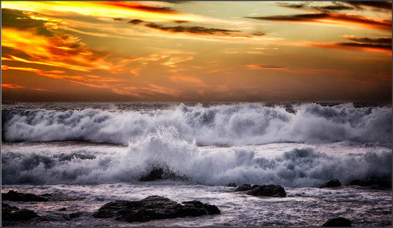
The composition of this photograph is really strong and well thought about. The time of day that it was taken gives a natural filter of the warm orange sky with the chilling grey sea. This contrast of tones gives the viewer the feel of being calm and smooth . I don’t think that there is a main focal point to this image as the picture as a whole is capturing it in itself. The depth of field is deep, most likely on a F, as most of the photographs content is in complete focus, except for the very background of the picture, on the skyline.There is a main point in my opinion, I believe that it is the raised wave on the left hand side of the photograph. I think it really captures the viewers attention.My personal opinion of this photograph is that is extremely well thought out. Baird clearly spent quite some time thinking about the time of day he would take the image, the depth of field, whether or not to edit it in Photoshop after taken, but I like how it is completely unedited, it shows the strong, natural striking look of the sea and sky in one clear photo.In this photo i like several things about this image this first thing is that the colors the photographer has use to contrast the different kind moods the colors present for example the co lour orange gives a calm and smooth feeling on the other hand the the color grey show how striking the waves look toward the viewer, this photo is trying to embrace the life of the sea nature withe the sunset with greater effect. This link to my photographs i have taken in anglsey this is because in mt photos ive used the similar techniques this photographer has used such as depth of field so catch the detail and beauty of the of the nature of the sea.
|


Best Pictures |
Worst picture |

|

|
|
Out of the group of pictures this is the best because the reflection of light from the water gives a really strong effect, also the level it was taken at (middle) also means the mountainous area withe water can be captured with the sea in the background which splits the picture up.
|
The reason I had put this picture as the worst isn't because I don't like it , its because of the way i had zoomed in to much in to the scenery which meant I excluded the mountain which had a huge impact on the effect the photo gives out.
|
land


Best photo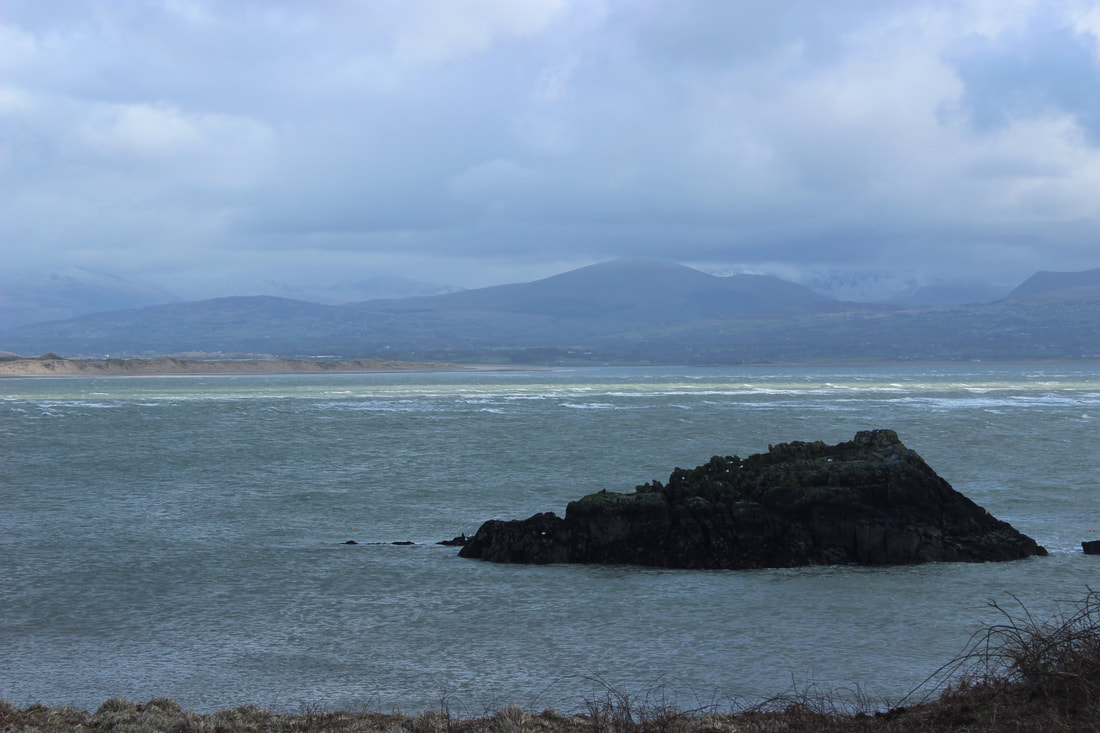
I have chosen this to be my best image from the set above as I have a lot of ideas which I can manipulate through Photoshop, by layering and changing the photo to black and white to add effect to the photo.
|
Worst photo
This is my worst photo from the set above as it is really blurry and the photo has been taken from a distance which makes the photo look crowded as there are multiple things in the photo and will be much harder to manipulate.
|
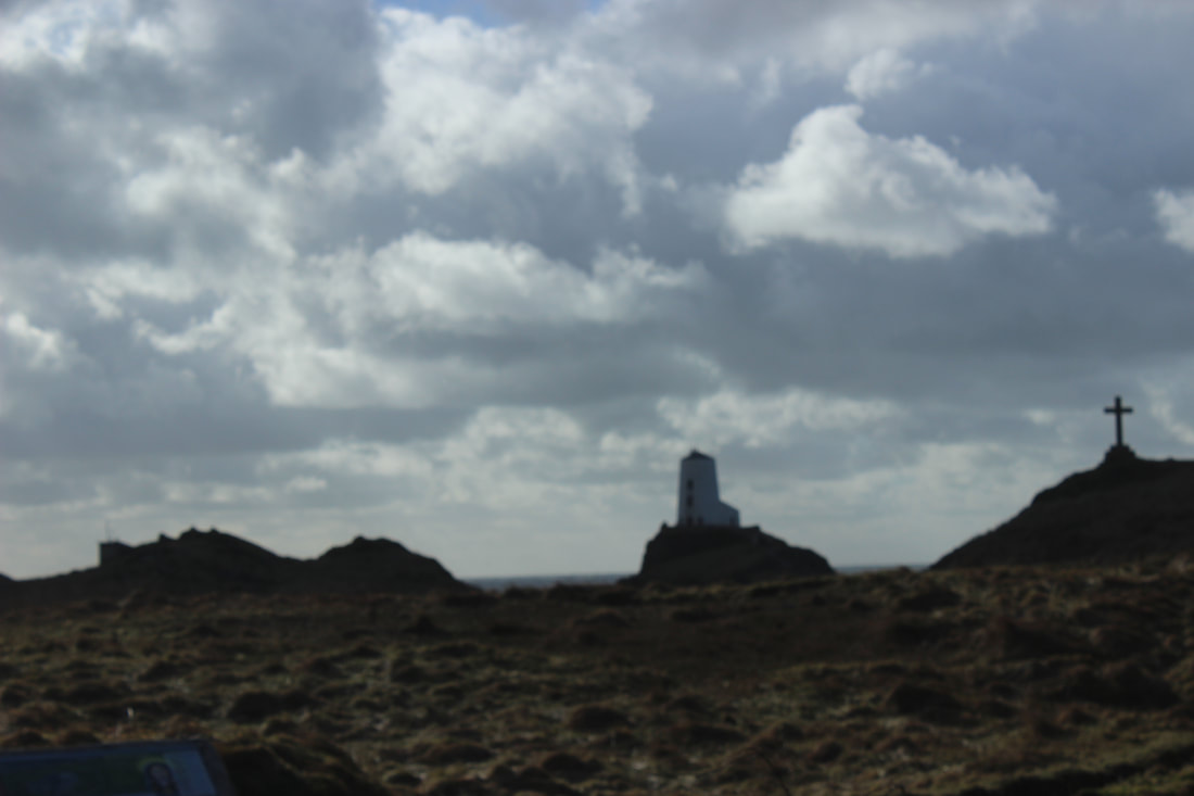
Light house


close up/leaves/trees/water


Best picture
I really like this photo this is because its a close up of a rock and the green color on the rock lets the photo standout, also the swirl around the rock also adds a massive effect because it looks satisfying as there are individual different shades of swirls inside of it which I really like.
|
Worst picture
I really dislike this picture as it was taken with no initial idea this is because the way there is only leaves grown on the side which really doesn't look professionally taken.
|
Woods


Best photos


Top 2 pictures


Photoshop
Experiment 1 (without tutorial) |
Final Image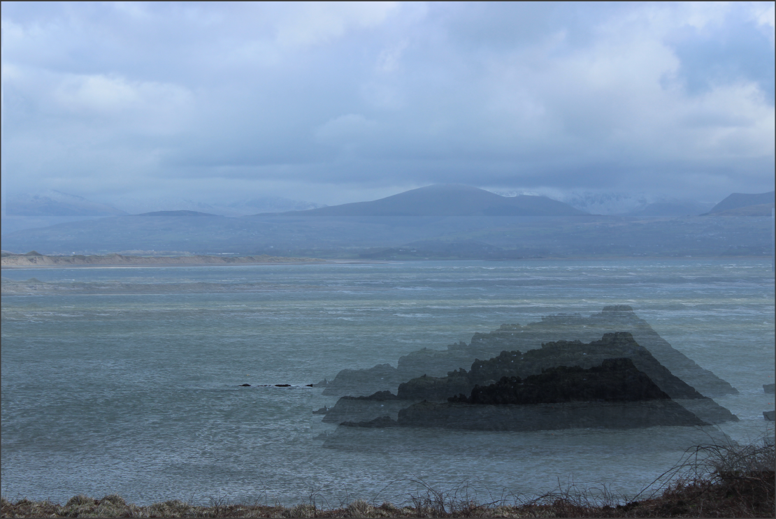
|


Photoshop photo 5 |
Final outcome |
|
|
|


Experiment 2 ( without tutorial) |
Final outcome |
|
|
|


|
|

|


|
|
This outcome consists of the same picture duplicated and moved down however still in line which gives a blury and foggy look to the photo, also by rubbing out the bottom part of the ground also helps me achieve the gloomy look I am going for. |
Experiment 3 (without tutorial)
|
|
|


Photoshop photo 4 |
Final outcome |
Photoshop photo 4
This photo which I have edited is based on a previous image which I have taken and edited,however in this photo i have duplicated it By pressing (Ctrl J ) then decreased the capacity of the duplicated which meant I could layer it to achieve this outcome Also I rubbed out the areas which include the branches to also help towards it.
|
Final outcomes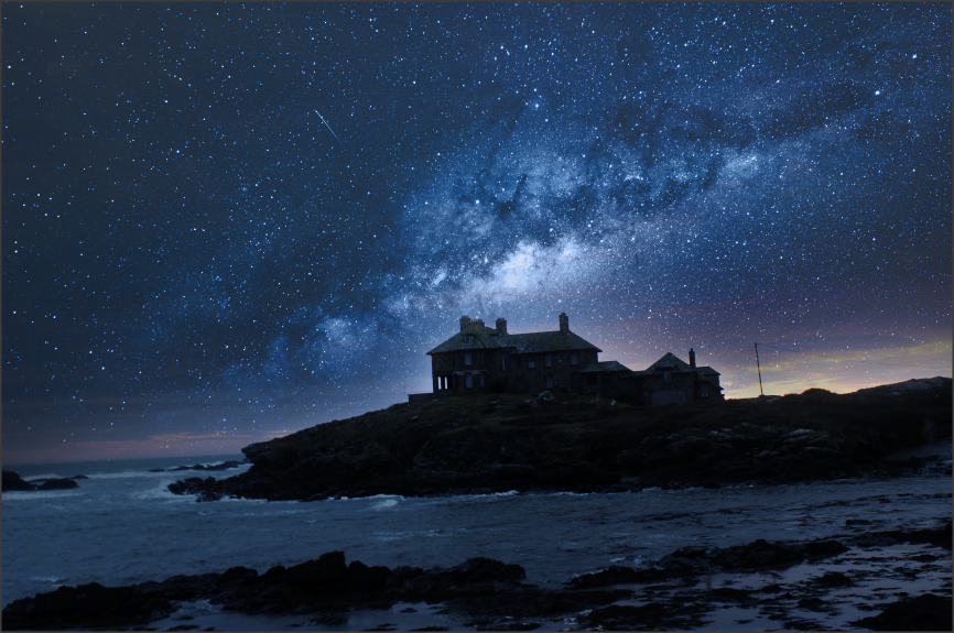
|


Final outcome
linking paragraph
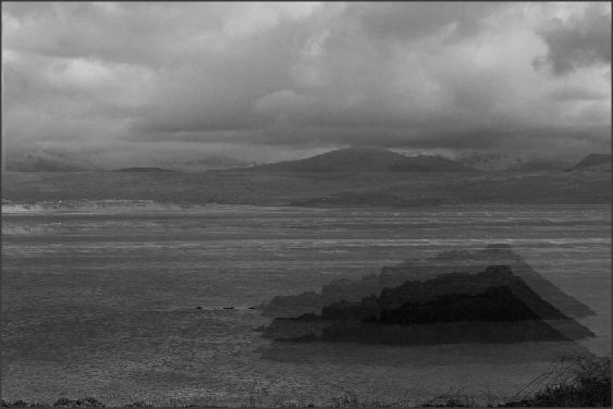
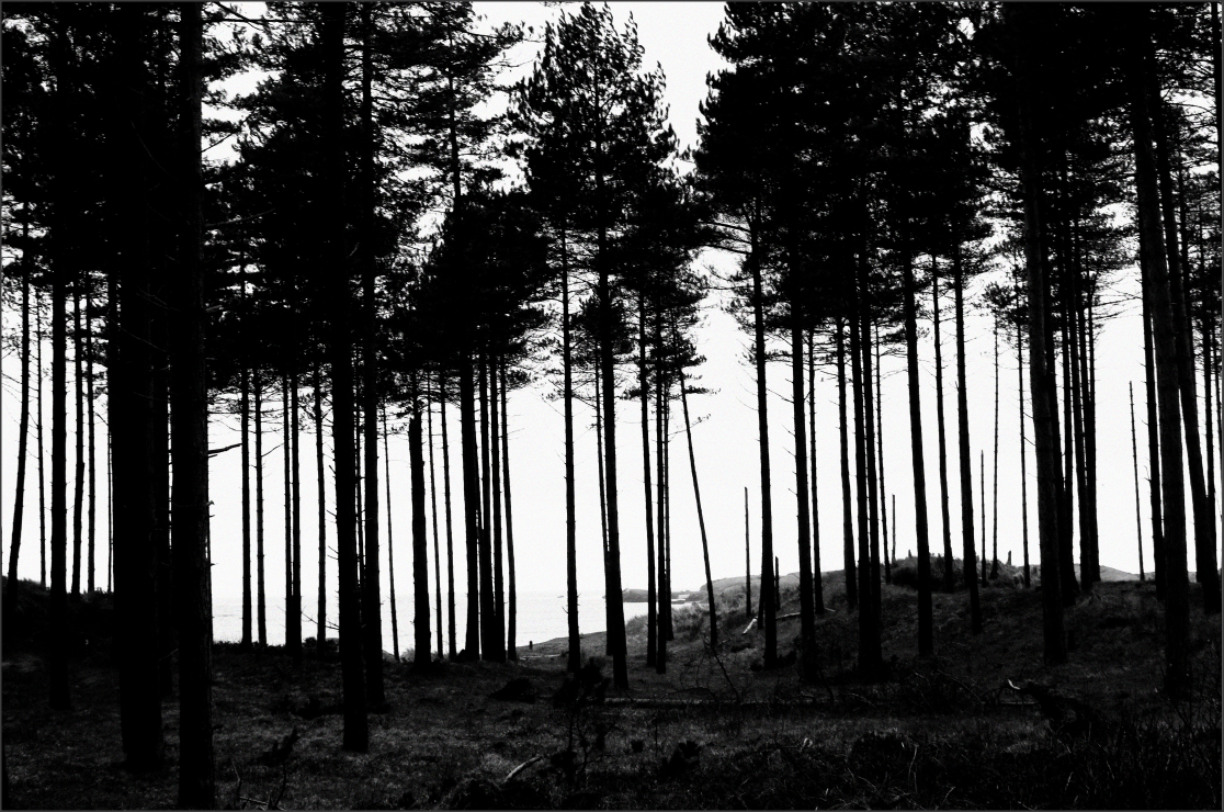
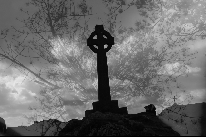
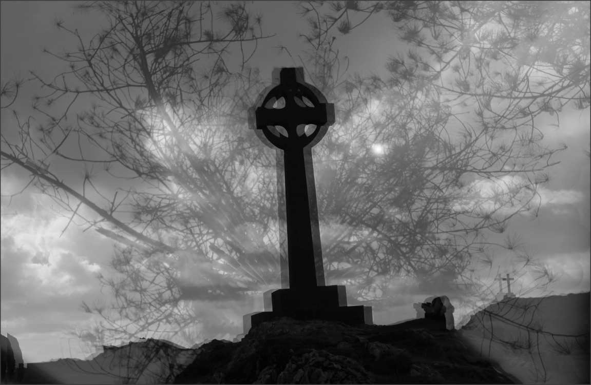
In February we went to Anglesey it was winter time so the weather was dull and dark this meant that there was some lighting which meant we had to change the aperture to high due to the dullness this meant I could play around with the setting to show my understanding of the camera setting and also to make my standard of work higher. In Anglesey we took shots of the rural areas such as the sea which meant we could capture the sunlight reflected off the open sea , also we went to places with cliffs which meant we could catch them with the dark tone due to the effect of the weather and time of year, then we where taken to a forest surrounded by nature which meant I could use setting such as depth of field and a worms eye view and close ups to capture the detail of nature .
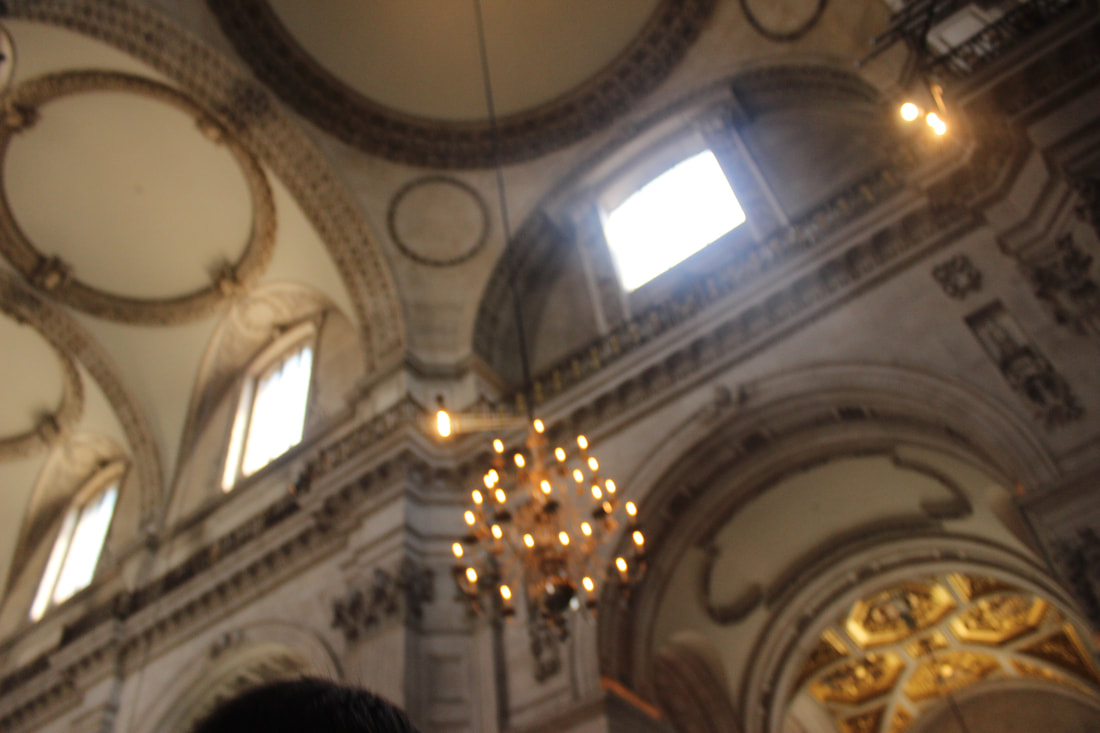
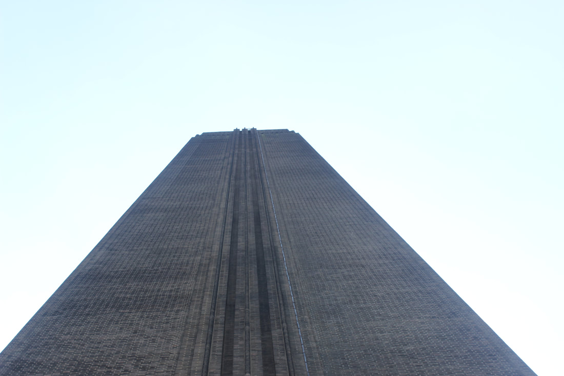
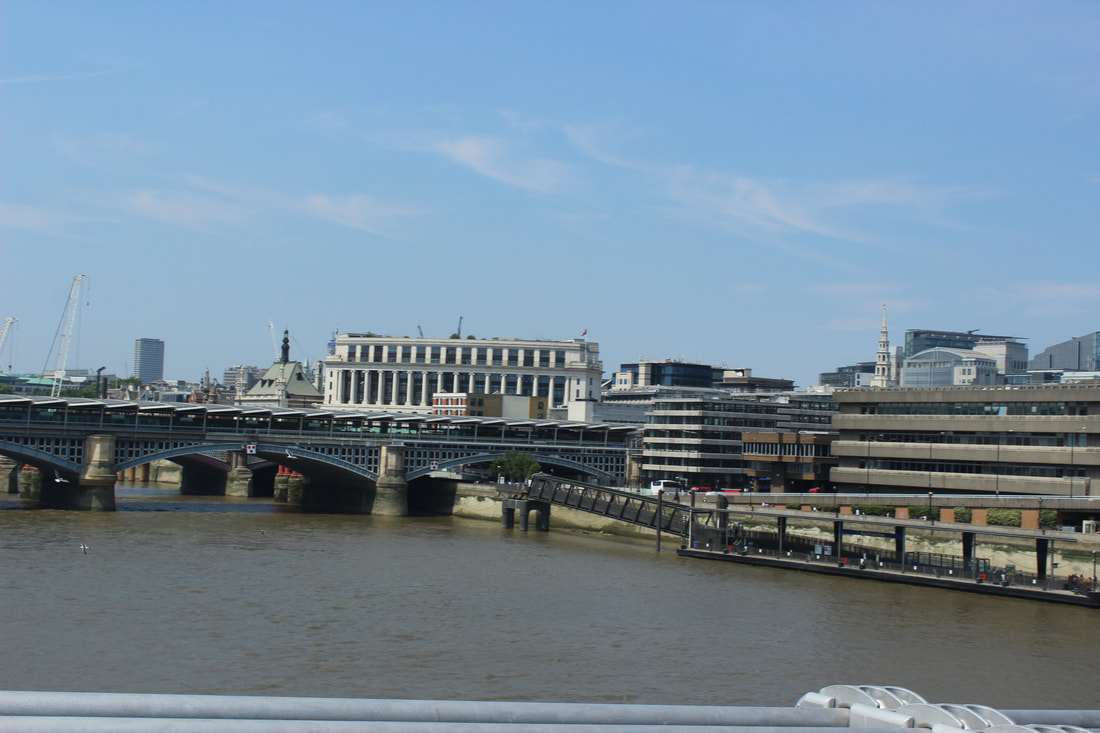
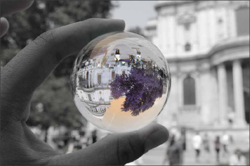
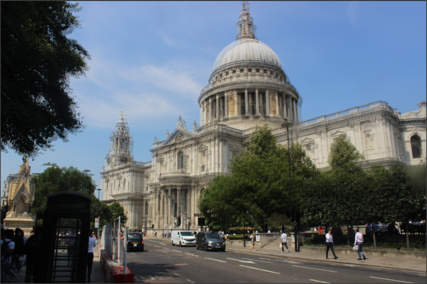
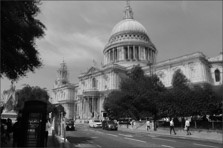
In the summer of July we went to London which meant the weather was bright and sunny this meant I had to lower the aperture to allow a less amount of light in to the camera also allowing me to adjust the white balance to make sure my photographs where not over exposed. I was able to capture the suburban areas of London such as the modern buildings, old architecture,bridges over the river and the iron work of the old power station in the Tate modern somethings that you cannot find in some other places. In St Paul's Cathedral there are a lot of patterns and detailing on the walls which where really interesting to capture. I was also able to capture the birds eye view of London and experience that I will never have the opportunity to do again, the photos the I took in London where strong and very useful.
In the summer of July we went to London which meant the weather was bright and sunny this meant I had to lower the aperture to allow a less amount of light in to the camera also allowing me to adjust the white balance to make sure my photographs where not over exposed. I was able to capture the suburban areas of London such as the modern buildings, old architecture,bridges over the river and the iron work of the old power station in the Tate modern somethings that you cannot find in some other places. In St Paul's Cathedral there are a lot of patterns and detailing on the walls which where really interesting to capture. I was also able to capture the birds eye view of London and experience that I will never have the opportunity to do again, the photos the I took in London where strong and very useful.
Mock exam

This photo is of a light house look a like on a mountainous area by the clear sea. The photographer has used a range of techniques and method to interest the viewer of this photo, the first thing being the rule of thirds as the photographer has included 2/3 of the land the other 1/3 being the sky and the sea. The light house has also been placed on the rule of thirds line. This will interest the reader as the light house will be the center of attention wondering about the reason behind taking this photo.
This image looks like it was taken in the 21st century time period I know this by the perfect placing of the light house on the rule of thirds line which suggests the photographer has used the grid to perfectly line up the building withe the line on the grid, this would only be on modern cameras. Also the use of white balance supports my prediction this is because the white balance setting ( Day light )is only on modern cameras . In my opinion I think that the meaning behind this photo could be to show the people the diversity of the people of Wales one side being modern city people and the other being the boring farm countryside people , the green land representing the full and humble people however the colour blue representing the empty and arrogant people of the city .
This image looks like it was taken in the 21st century time period I know this by the perfect placing of the light house on the rule of thirds line which suggests the photographer has used the grid to perfectly line up the building withe the line on the grid, this would only be on modern cameras. Also the use of white balance supports my prediction this is because the white balance setting ( Day light )is only on modern cameras . In my opinion I think that the meaning behind this photo could be to show the people the diversity of the people of Wales one side being modern city people and the other being the boring farm countryside people , the green land representing the full and humble people however the colour blue representing the empty and arrogant people of the city .
David Muench
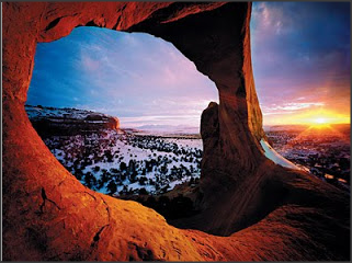
This is one of my favourite photographs taken by Muench. The composition and contrast of the vibrant red rocks with the cool blue sky give the image an eerie feel, as the two tones boost the whole photographs feel through colour. The rule of thirds has clearly been applied, as the moon is on the left power line going vertical. There is a clear deep depth of field, as the whole image is in focus, including the mountain peaks in the background. The focal point of the photograph is most definitely the moon, as it is the brightest piece in the image, and it draws my attention straight to it. I also think that framing the moon in the centre of the rock formation draws more attention to the moon as we have that red contrasting with the white.
The composition of the photograph is very well thought out, I have already mentioned that the rule of thirds has been applied, as the moon is on a clear vertical power line, but the cropping of the image has been done to a T. There is just enough of the background in view to catch our eye, but not too much that it floods the photograph solely.
The lighting is exquisite, there is a clear gradient from the top of the picture to the bottom, as it blends from the dark blue sky to the lighter blue as it gets closer to the ground. I think that it is a hard lighting technique, as there is clear dark tones in the photograph. As I previously stated, the focal point of this photograph is the the moon in the centre of the rock formation. Muench has achieved this by very strategically placed the moon in his image on a power line, whilst still keeping it contained in the rock canyon. In my opinion, Muench has used a tripod to achieve this perfectly level photograph. The way that it just comes together so expertly and accurately backs this up.
This photograph influences my ideas about what I'm going to do with this unit as it persuades me to take landscape photographs of natural form, and using bright opposing colours to contrast one another. My personal opinion of this image is that it has been taken perfectly. When I look at it, I feel calm and peace. The use of the full focus makes me feel like I'm really in the image itself, instead of just looking at it. I love how the image is completely unedited, it's the raw setting that makes me feel cool and calm.
I believe that the meaning behind the photograph is that there is beauty in all things, even something as simple as a canyon at twilight.
London
Train station


Streets of London


Best picture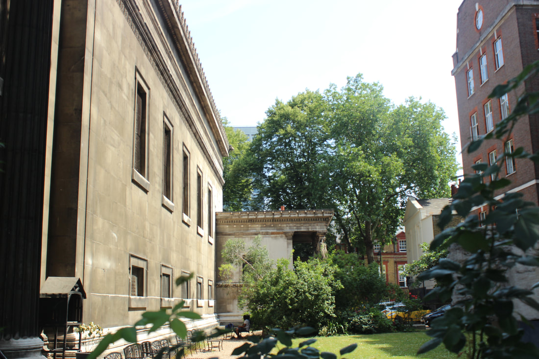
This is the best picture as the colours in this picture all blend together and you can see the contrast between the brown green and red which I really like and admire.
|
Worst picture
This is my worst picture as it is very blurry out of focus and not taken from a steady angle which makes me dislike this photo.
|
Underground/Tube


Best |
Wost |

|

|
British museum


Cathedral


millennium bridge


Best picture |
Worst Picture |
|
|
Power station


Photoshop photo 6 |
Final outcome |
|
|
|


Photoshop photo 7 |
Final outcome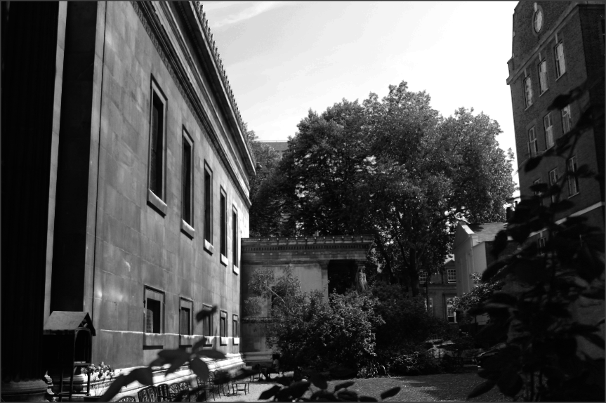
|


Photoshop photo 8 |
Final outcome |
|
|

|


Photoshop photo 8 |
Final outcome |
|
|

|


Photoshop photo 9 |
Final outcome |
|
|
|


Mock exam |
Nick Waplington: Fairies, London Fields, 2003

This photo includes a beautiful scenery of people at a field or a park in London , from looking at this photo I know that it is set at summer time, also insight you can see multiple people who look like they have families including children this is from the fact there are children playing around on the open field, the photographer has taken a really good shot of the impact the weather is having on the people also this picture also shows how the people do go out and enjoy the outer world.
The photographer has used different techniques , elements and techniques to really make the photo high quality, the photographer has focused mainly on the environment, the photographer has placed the people in a line across the middle the bottom half of the photo is the rich green given off from the grass which gives out a very positive feeling to the viewer as the color green represents happiness and the top part being the summer grown trees with the leaves being green and yellow which also has a huge impact on the viewer because it also gives off an calming atmosphere. This photo looks like it has been taken from a tripod which offers the stability and and accuracy of the picture, the photographer seem like he/she has gone to the bottom of the little uneven grown and taken this shot, this because in order to include so much of grown you will need to be a distance and your at an angle. Also the lighting of this picture is perfect in the concept of it not being to dark of over exposed this also adds the effect of color to the picture and make it seem more rich in colors to attract attention this also means the the colors make this photo seem more like a fairy tail theme. By the photographer putting the people in the middle the it also adds to the color we can see the color pink,yellow,orange and red which all have connotations of an exiting and happy and a fairy tail type atmosphere, which also effects the viewer when presented by these things causing them to feel a positive way towards the picture.
This picture seems like it was taken in the 21st century, this is because the camera used seems like its a modern day camera, this is because the photo is in high definition which presents the picture in a high quality state, there could be multiple meanings behind this photo such as the mood in London changes when the summer approaches, or it could mean the people of the London are all unite together. This image was published in the time period of 2007-2008, which we know wasn't long ago giving technology as an advantage. There could be also multiple reasons of why the photographer has taken this picture, some could vary from the they wanted to show how much of a great impact fact the weather and season has had on the people and want people to see how people have changed in their daily mid set of the typical busy city people to now more relaxed and calmer they currently are , in contrast to the attitudes presented by them early on in the year. This picture has been published and viewed my a lot of people which means the message and the effect from the photo will hopefully change the viewers everyday mindset of being negative.
This links back to my work and project from the weird and wonderful, this is from the part when we needed to chose a theme such as disillusion or something weird like using a fairly tail theme to create an huge effect, this is important because I can learn from this photo and take techniques from this such as the way they used the spacing of the image and the lighting to also make my photo to make my photos seem more in the theme of weird and wonderful, also the I want to take the way he had made the viewer think of multiple interpretations of why he had taken this image and the idea behind it, this is because by doing this it adds more effect upon the viewer by making him/she think about it.
Overall, I like this picture due to the multiple reason of the colors chosen in the photo which gives the photo a more fairy tail (weird and wonderful) , by doing this the viewer will appreciate the photo more and it will also leave the viewer feeling positive and relaxed from he multiple effects from the color, also it represents the 21 century and the futurist ideas.
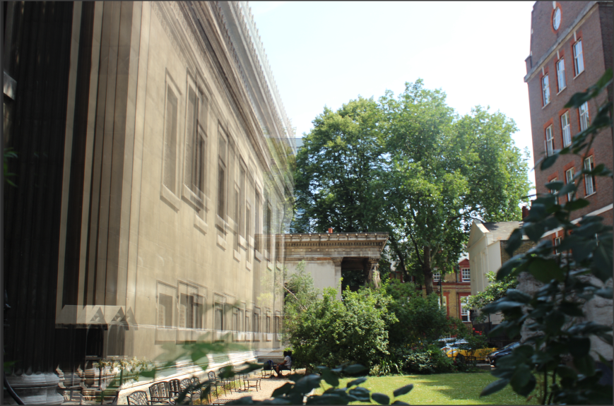
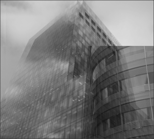
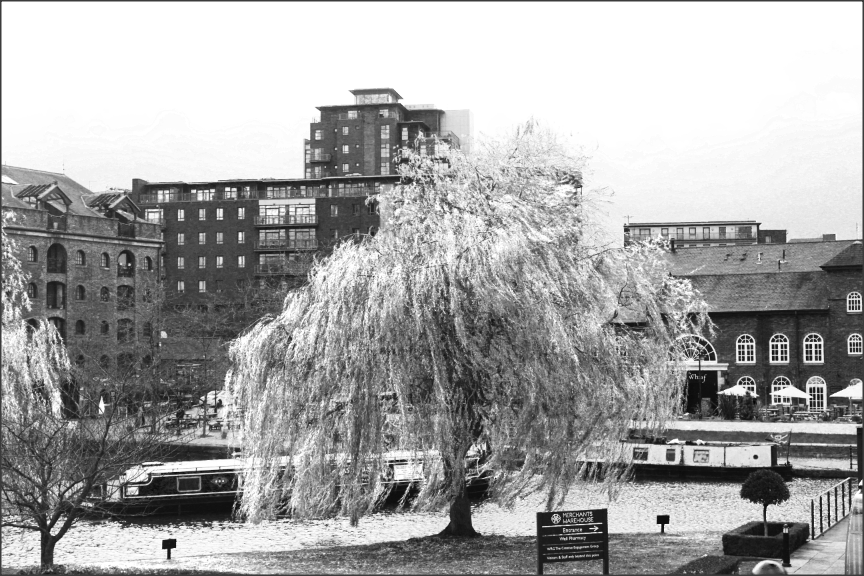
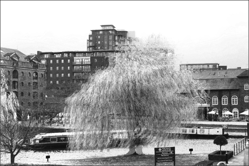
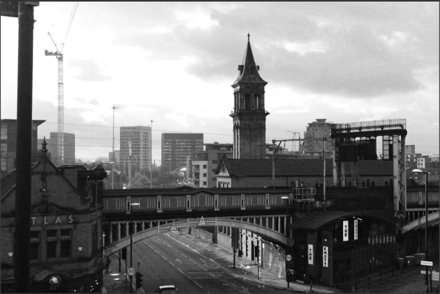
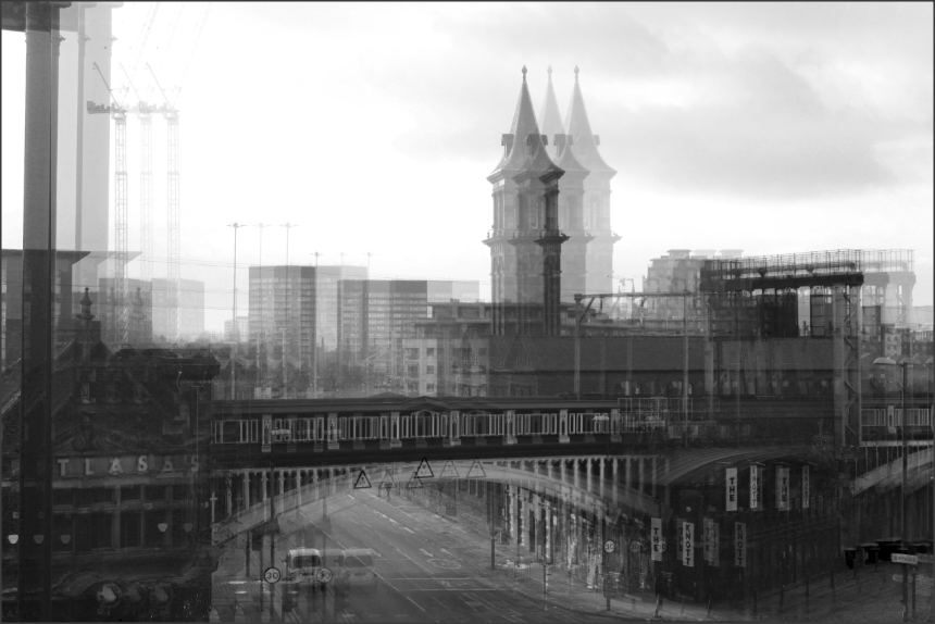
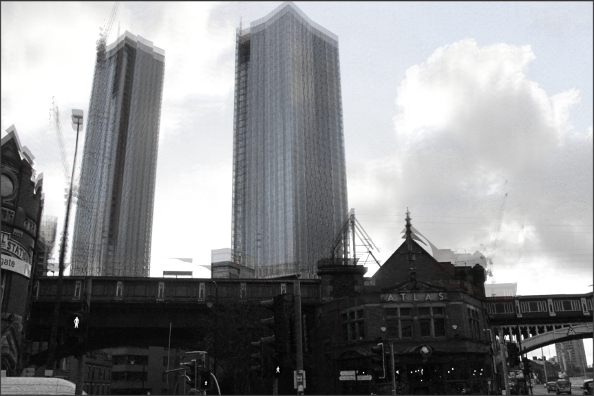
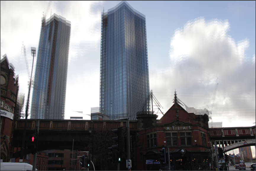
Manchester
For the rest of this project, I plan on focusing my attention towards my Manchester photographs, as I believe that they are the strongest ones I have for this unit. I plan on going down a more natural route, centralizing my mind on using Photoshop to only add fillers and also manipulate it and to try not create an abstract pieces like I did for my 'Weird and Wonderful' project. I want to work with architecture and nature themed areas, as I feel that this would be something I could thrive in, as I have access to both literally on my doorstep.
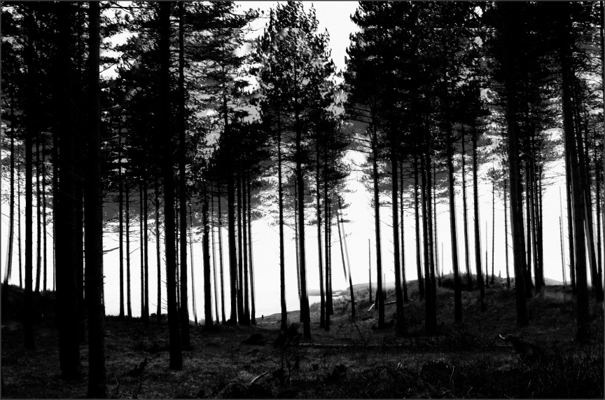
Nature


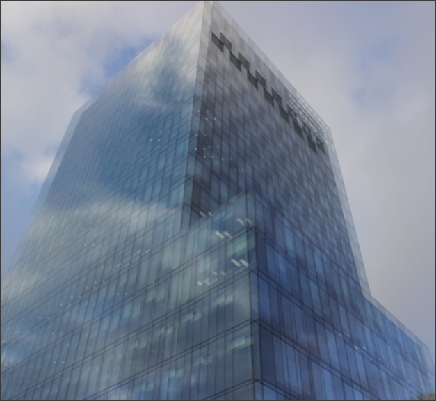
Buildings


River and bridge


The Royal exchange


Lights and decorations


Ryland Library


Skies


Photoshop 1 |
Final outcome 1 |
Final outcome 2 |
|
|
|

|


Photoshop 2 |
Final Outcome |
|
|
|


Photoshop picture 3 |
Final outcome |
|
|
|


Photoshop picture 4 |
Final outcome |
|
|
|


Photoshop picture 5 |
Final outcome |
|
|
|


Photoshop picture 6 |
Final outcome |
|
|
|


Photoshop picture 7 |
Final outcome |
|
|

|


Photoshop picture 8 |
Final outcome |
|
|

|


Photoshop picture 9 |
Final outcome |
|
|
|


Final Outcomes


Project Evaluation
This project was entitled 'Changing Landscapes', and my thoughts and feelings varied towards it between stages. Throughout my 'Anglesey Landscape' branch of this unit, I did not really have that much love for the project, as I felt as though the development of my photographs didn't capture any part of me as a person, or the passion that I have for photography. However, when I moved onto my 'Manchester Landscapes' branch, the more modern aspects that came with it (such as architecture) really struck gold with me, and I felt like my passion had resurfaced and been implemented into the rest of the project.
The part of this project that I enjoyed most was definitely the process of editing and manipulating my photographs of Manchester in Photoshop. This was mainly because the path I decided to follow was more natural editing. By this, I mean taking my landscape photographs, and slightly enhancing the saturation, hue, exposure and more. I did experiment with different editing techniques, such as layering and drawing with the magnetic lasso tool, but I found the more natural-looking edits to be more appealing and significant to me. As stated, I did experiment and experience new ways of editing my photographs in Photoshop, whereas the outcomes did turn out well-developed and showed off my editing abilities, I still chose the path of natural editing, as I felt like landscape photography didn't really require any flashy editing or surreal-looking outcomes.
The technique that I would like to evolve further would have to be the aforementioned natural editing. I would really like to experiment with more equipped editing software's, that contain more advanced editing tools that could help me further my skills and talents. In regards to research, I studied many photographers who's works influenced my own photographs and development processes, such as , who's close-up photographs heavily inspired me to create some of my own when I took a class trip to Anglesey. However, there are three main photographers that I chose to base my project around, and they are Stewart Baird and Adam Burton. Baird's photography centers around crashing waves and seascapes, which is why I selected him to be the main photographer for my Anglesey section of this project. Muench is one of the photographers that I based around my urban landscapes (mainly Manchester, as his natural archways link to my own man-made one).
I would say that both Goh's and Muench's works greatly influenced my own photographs, as Goh's black and whites with the architectural aspects and Muench's nature themes are both implemented into my own photographs. I loved the idea of having nature in my photographs, but I also wanted to focus on architecture and more modern-world themes, so I conducted my work in such a way that combined both of these aspects. I would say that the most successful part of this project for me was my more retro take on the whole unit idea. Although my 'natural landscapes' route seemed at bit more on the easy side to me at first, I realised that it actually took me a lot longer to develop outcomes that were the embodiment of what I envisioned. Since I spent a lot of time over my GCSE Photography experience focusing on editing with bright, abstract colours, bizarre shapes and surreal images, I had to completely teach myself how to subtly enhance my landscape photographs, whilst still making it known that I had implemented both my photographers research and my own ideas towards the project as a whole.
